Embroidery Lettering Basics: How to Stitch Clean, Readable Letters
How to choose a letter style, match strand count to letter height, pick the right stitch and keep curves smooth, with a short practice word to try.
Letters are less forgiving than flowers. A petal that leans a little still reads as a petal, but a wobbly “e” reads as a mistake, because everyone knows exactly what an “e” should look like. The good news is that clean lettering depends on a handful of decisions made before the first stitch: the style of letter, its height, the number of strands, and the length of each stitch. Get those right and the stitching itself is simple line work.
Choose a Letter Style That Suits Thread
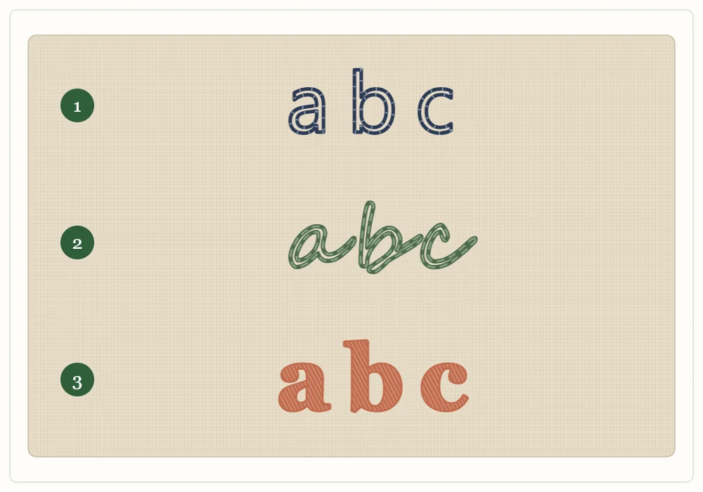
Thread has thickness, so it cannot copy every pen stroke. Two kinds of lettering work reliably for beginners:
- Simple print. Separate letters made from single lines, with open, rounded shapes. This is the easiest style to keep readable at small sizes.
- Flowing script. Joined letters with generous loops. Script hides small stitch irregularities well, but it needs room: tight loops in “e”, “a” and “o” close up if the letters are too small.
Avoid styles with hairline strokes, tiny serifs or very narrow counters (the enclosed spaces inside letters). If a stroke on paper is thinner than your thread, it will look heavier once stitched, and neighboring strokes will merge.
When you want thick-and-thin lettering, draw each thick stroke as an outlined shape at least 1/8 in (3 mm) wide, so there is space to fill it.
Match Letter Height, Strands and Stitch
Measure letter height on the lowercase letters without tall parts, such as “a”, “c” and “e”. The smaller the letter, the finer the line has to be. Use this table as a starting point, then stitch one test letter on a scrap of the same fabric.
| Letter height | Strands | Suggested stitch |
|---|---|---|
| Under 1/4 in (6 mm) | 1 | Backstitch with very short stitches |
| 1/4 to 1/2 in (6 to 12 mm) | 1 to 2 | Backstitch or split stitch |
| 1/2 to 1 in (12 to 25 mm) | 2 to 3 | Stem stitch, split stitch or backstitch |
| Over 1 in (25 mm), single line | 3 | Stem stitch or chain stitch |
| Any height with thick strokes | 2 to 3 | Outline in split stitch, fill with satin stitch |
If you are unsure how strand count changes the weight of a line, the embroidery thread guide covers how to separate floss and what each count looks like.
The Best Stitches for Letters
All four of these are covered with needle positions in the guide to basic embroidery stitches. Here is how each behaves on letters.
Backstitch
The most controllable choice for print letters and anything small. Each stitch is separate, so corners stay sharp and you can change direction at any point. The line looks slightly beaded.
Stem stitch
A smooth, rope-like line that suits script. Keep the working thread on the same side of the needle for the whole line, usually the outside of the curve, or the twist will break. Stem stitch is awkward on sharp corners; end the line at the corner and start again in the new direction.
Split stitch
Each stitch comes up through the middle of the one before it, which makes a fine, slightly braided line. It follows tight curves well and is a good base under satin stitch. Use an even number of strands if you can, so the needle splits them neatly.
Satin stitch
For thick strokes only. Outline the stroke in split stitch first, then lay satin stitches across the stroke, over the outline, at a slight slant. The outline gives the fill a raised, even edge.
Draw Guidelines Before You Draw Letters
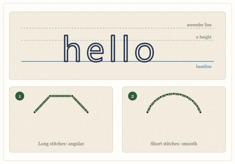
Most uneven lettering is a drawing problem, not a stitching problem. Rule three light lines on the fabric with a water-soluble pen before adding any letters:
- the baseline, which every letter sits on;
- the x-height line, which marks the top of letters such as “a”, “c” and “n”;
- the ascender line, which marks the top of tall letters such as “h”, “l” and “t”.
Line the baseline up with a thread of the fabric weave so the word does not slope. Then draw or trace the word between the lines. Any of the methods in the guide on how to transfer embroidery patterns will work for lettering; a light source and a fine pen give the thinnest lines.
Spacing
Judge spacing by eye, not with a ruler. Round letters next to each other, such as “oo”, need to sit closer than two straight letters, such as “ll”, to look evenly spaced. Leave a gap about the width of a lowercase “o” between words. Squinting at the drawn word, or turning the hoop upside down, makes uneven gaps easier to spot.
Shorten Your Stitches on Curves
A curve made of long stitches turns into a row of straight segments with visible angles, as the close-up shows. On straight strokes, stitches of about 1/8 in (3 mm) are fine. On the bowl of an “a” or the loop of an “e”, halve that length, and make the stitches smaller still on the tightest part of the bend. Count on three or four stitches at the very least to turn a small loop.
Tip
Where two lines meet, as in the junction of an “n” or the cross of a “t”, share a hole. Bringing the needle up in the hole that already holds the end of the other stroke keeps the join tight and avoids a gap.
Where to Start and Stop
Follow the path a pen would take. Stitch each stroke in the direction you would write it, and in script, carry on through the joining stroke into the next letter without ending the thread.
Print letters are different, because nothing joins them. The thread that travels across the back from one letter to the next can show through the fabric as a faint shadow, especially dark thread on light or thin fabric.
Watch out
Do not jump more than about 1/4 in (6 mm) across the back between letters. For a longer gap, weave the thread through the back of stitches already made until you reach the next letter, or finish the thread and start fresh.
Dots on “i” and “j” are best made as a single French knot or a tiny straight stitch, worked last, with the thread secured directly behind it.
A Short Practice Word
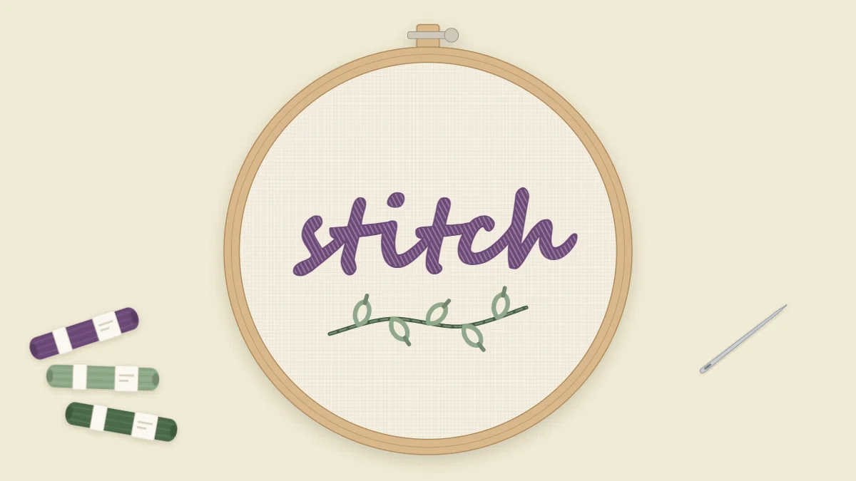
The word “stitch” is a useful exercise: it has tight curves in the “s” and “c”, crossed strokes in the two “t”s, a dot on the “i” and a tall “h”.
- Rule a baseline, an x-height line 1/2 in (12 mm) above it and an ascender line about 3/8 in (1 cm) above that.
- Write the word in your own joined handwriting, or in plain print, between the lines. Redraw any letter that looks cramped.
- Thread two strands in a color that contrasts with the fabric.
- Stitch the word in stem stitch for script or backstitch for print, shortening the stitches on every curve.
- Add the crossbars of the “t”s as single straight stitches, then the dot of the “i”.
- Rinse out the guidelines and compare your curves with your straight strokes. The curves show where shorter stitches would help next time.
Once a single word looks even, lettering opens up plenty of projects: initials on the corner of embroidered linen napkins, or a name on a collar or cuff, which the guide on how to embroider on clothing explains how to stabilize.
Frequently asked questions
What is the best stitch for embroidering letters?
Backstitch is the easiest to control for print letters and small text. Stem stitch gives a smoother line for script, and split stitch handles tight curves well.
How many strands of floss should I use for lettering?
Use 1 to 2 strands for letters under about 1/2 in (12 mm) tall and 2 to 3 strands for larger letters. Stitch one test letter on a scrap first to check the weight of the line.
Why do my embroidered curves look jagged?
The stitches are too long for the curve. Halve your stitch length on rounded parts of letters, and make the stitches smaller again on the tightest bends.
How do I stop thread showing through between letters?
Avoid carrying thread more than about 1/4 in (6 mm) across the back. Weave it through the back of existing stitches to reach the next letter, or end the thread and start again.