How to Plan Colors for an Embroidery Pattern
Start from the fabric, keep to three to five colors and check light, medium and dark before you stitch. Three easy schemes and a quick grayscale test.

Most color trouble in embroidery comes from two causes: too many colors, or colors that have different names but nearly the same lightness. Both can be caught before the first stitch, with nothing more than the skeins, the fabric and a phone camera.
Start with the Fabric
The fabric is the largest block of color in any piece, and every thread is seen against it, so decide on it first. Natural linen is warm and slightly gray. It softens bright colors and flatters earthy ones such as sage green, mustard and terracotta. Bright white raises contrast and makes every color look cleaner and cooler. Colored and dark fabrics change the rules most of all: threads darker than the cloth sink into it, and pale threads do the work. If you are still choosing cloth, the fabric guide explains which weaves are easiest to stitch.
Keep a Small Design to Three to Five Colors
A motif that fits a 4-inch (10 cm) hoop has room for only a few ideas. Three colors are enough for most small designs, and five is a comfortable upper limit. Past that, each color appears in such small amounts that the design starts to look scattered. If a pattern seems to need more variety, add a lighter or darker version of a color already in the palette before adding a new one. The five-arch rainbow pattern shows how full five muted colors already look in one hoop.
Value Matters More Than Hue
Hue is the name of a color: green, pink, blue. Value is how light or dark it is. Two threads of the same value blur together at arm’s length even when their hues differ. A medium sage leaf beside a medium dusty rose petal reads as one soft shape. A palette with one light, one medium and one dark thread stays readable from across a room, almost regardless of which hues you pick.
Tip
Lay the skeins on the fabric, take a picture with your phone and switch it to black and white. If two skeins turn the same gray, they will not separate in the stitching, so replace one with a lighter or darker shade. Squinting at the skeins until the colors dull does a similar job.
Three Easy Color Schemes
You do not need color theory beyond a basic color wheel to build a palette that works. These three schemes cover most small designs.
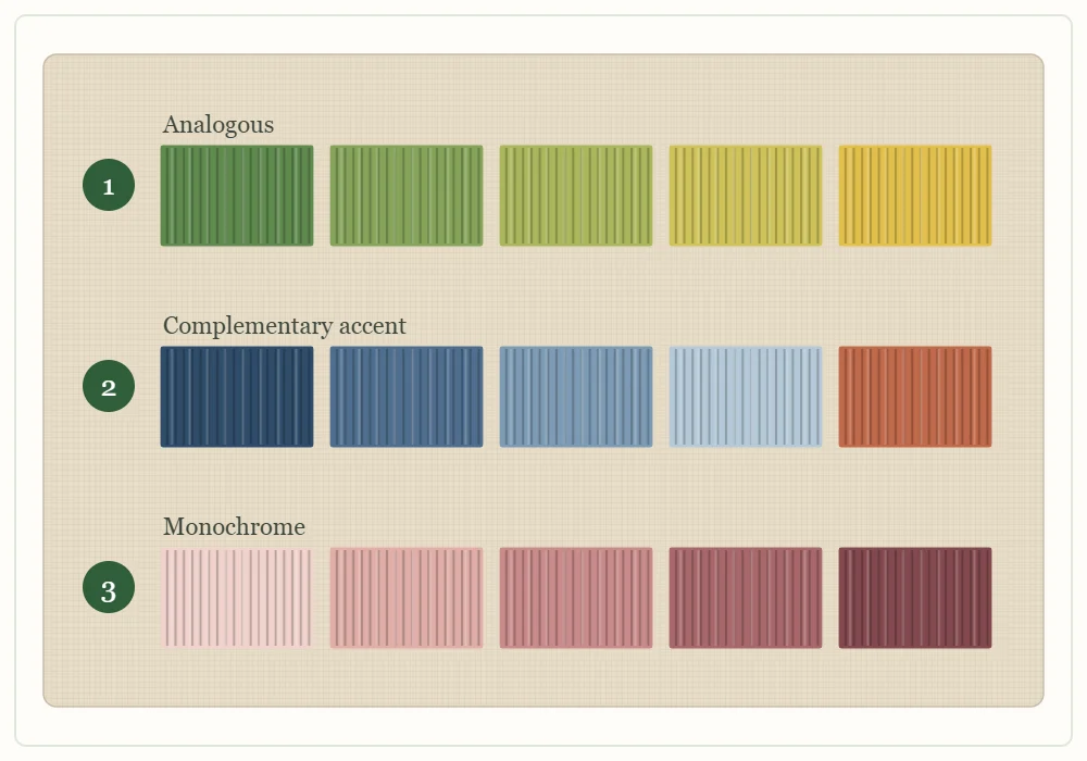
| Row | Scheme | How it works | Example | Effect |
|---|---|---|---|---|
| 1 | Analogous | Colors that sit next to each other on the color wheel | Greens shading through to yellow | Calm and natural, well suited to foliage |
| 2 | Complementary accent | Mostly one color family, plus a small amount of its opposite | Blues with a touch of terracotta | Lively, with the accent pulling the eye |
| 3 | Monochrome | One hue stepped from light to dark | Dusty rose from pale to deep | Quiet and modern, with value doing all the work |
Opposites on the wheel are the familiar pairs: blue and orange, green and red, yellow and purple. In the accent scheme the opposite color has to stay small. In equal amounts the two compete, and the design loses its focus.
Dominant, Secondary, Accent
Whatever the scheme, give the colors unequal shares. A rough split of about 60, 30 and 10 percent is a useful rule of thumb. It does not need measuring.
- Dominant: the color that covers the most ground, usually stems, leaves or the main outline.
- Secondary: the supporting color, often the flowers or the second-largest shape.
- Accent: the smallest amount, placed in knots, centers and tiny details. It can be the brightest or most contrasting thread, because there is so little of it.
The easy leaf sprig pattern works this way: sage green leaves carry most of the design, a deep green stem supports them, and three mustard knots at the tip provide the accent.
Test Before You Stitch
- Lay the skeins directly on the fabric, in daylight if you can. Lamp light shifts most colors toward yellow.
- Arrange them in rough proportion: the dominant color fully visible, the accent only peeking out from under the others.
- Pull a single length from each skein and lay it across the cloth. A skein looks darker and richer than a thin stitched line of the same floss will.
- Squint, or take the grayscale picture, and check that you can see a light, a medium and a dark.
- If you are still unsure, stitch a few short lines of each color on a scrap of the same fabric and look at them from a few steps away.
The Same Color on Light and Dark Fabric
A thread has no fixed strength. It is only as visible as its contrast with the cloth behind it.
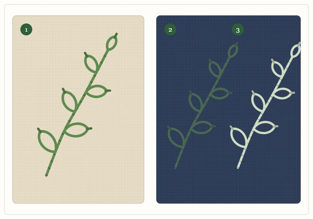
On light linen, the mid-green sprig is easy to read because the thread is clearly darker than the fabric. On navy, that green and the cloth are close in value, so the leaves almost disappear. The pale sage version beside it stands out because it is much lighter than the navy, even though it is still green. The rule for dark fabric follows from this: choose threads several steps lighter than the cloth, such as cream, pale sage, blush or mustard. The moon and stars pattern uses only cream and mustard on navy for that reason. The reverse is true on white fabric, where white and very pale threads vanish and need a tinted cloth to show.
Watch out
Deep reds and dark blues sometimes release dye when wet. If the piece will be rinsed to remove transfer lines, test a short length of each strong color on a damp white scrap first. The thread guide explains how to check floss for colorfastness.
Keep a Stitched Swatch Card
Skeins in a box give only a rough idea of how a color will look once it is stitched. A swatch card gives an exact one, and it takes a few minutes per color to build.
- Cut a strip of the fabric you use most, or one strip each of a light and a dark fabric.
- For every color you own, stitch a short bar of satin stitch about 1/2 in (12 mm) wide, plus one backstitch line in two strands beside it. The bar shows the color as a fill and the line shows it as an outline.
- Write the color name next to each swatch in pencil, along with the number from the skein label so you can buy the same shade again.
- Group the swatches by family and order each family from light to dark.
When you plan a new design, fold the card so that candidate colors sit side by side and hold it against the fabric. Three swatches that look right together on the card will look right in the hoop, and the grayscale test takes one more picture. Add each new skein to the card when you buy it, and the planning for the next pattern is already half done.
Frequently asked questions
How many colors should a small embroidery pattern have?
Three to five colors is enough for a design that fits a 4-inch (10 cm) hoop. If you want more variety, add a lighter or darker version of a color you already have before adding a new one.
How do I know if my thread colors have enough contrast?
Lay the skeins on the fabric, take a picture with your phone and turn it black and white. If two skeins become the same gray, swap one for a lighter or darker shade.
What thread colors show up on dark fabric?
Choose threads several steps lighter than the cloth, such as cream, pale sage, blush or mustard. Mid-tone and dark threads sink into navy or black fabric and almost disappear.
What is a stitched swatch card?
It is a strip of fabric with a short stitched bar and line in each floss color you own, labeled with the color name. It shows how a color looks once stitched, which a skein cannot do.